


I love it too and it was today’s bestseller.
Would any customers be offended if we adjust the list level to move down the aurora part there a little though? I’m thinking this could help a bit with legibility!
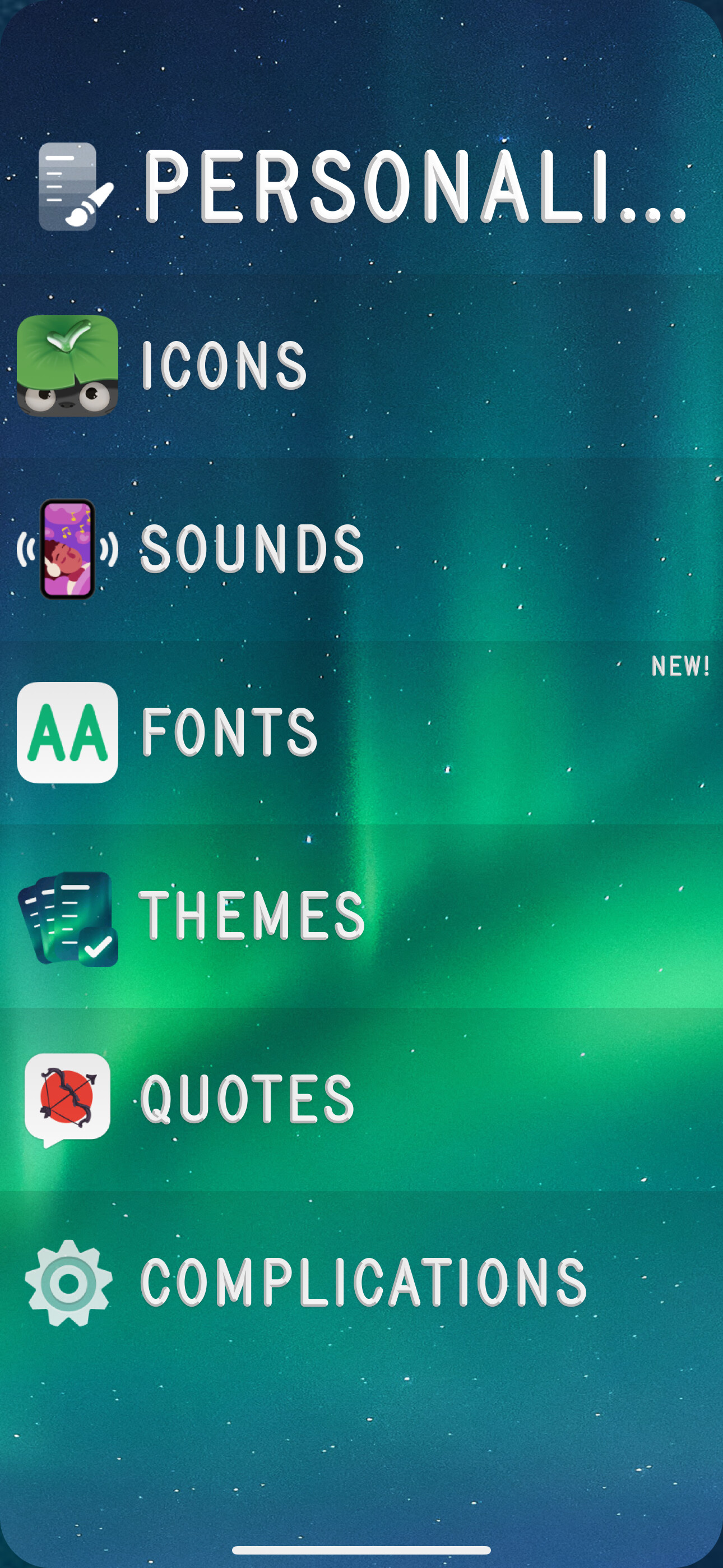
What theme is that? I think I might have tried it a while back but dismissed it as I was probably using a really light font. It works really well with the chunkier font weight you’re using, as you don’t tend to lose the text against the background as much when the contrast reduces lower down. I think it also works really well with the Instagram icon too. Nice!
This is the Heatmap Light theme.
I’ll say from myself, personally, I don’t mind at all, I also thought about it, that it would be nice to move down a little.
Well, that’s annoying! I love the way it looks in the menus i.e. fading from purple to light blue, but in the lists themselves, it goes red to light orange, which I’m not as keen on! I wonder if there is another theme that looks more like the menu colours within the lists themselves….? The menu has a nice Synthwave style aesthetic, but against a white background (which I really like for a change), not black, as is the norm:

I understood you. If I don’t confuse anything and haven’t forgotten it, the Birthday Cake theme has a white background and a rolling gradient font, both in the menu and in the lists themselves.
@joeb Thanks! Glad you like it, yeah it works incredibly well I’ve been using it straight for days. I personally love the colour changes between the list list and actual lists, it’s just a bit adventurous as it’s a light version of the Heatmap theme as @alx_ras pointed out.
I don’t have the Birthday Cake theme anymore but I just remembered I used it a LOT before The Great Beta Wipe. I hope it appears in the shop again, I’d love to grab it.


Keep being reminded by these, we need to polish out those rounded corners for screenshots! Gorgeous but they stick out to me now. (They’re mostly relevant for when you tap into a list for the opening animation.)


We should make more like this, Kokomo / Miami / Fire and Ice are all popular.

Yeah this set also sold pretty well, though I think the ‘destination’ themes of Miami and Kokomo is something we should do more of! It’s interesting how everything comes together for a top seller, like good day theme and vibes for the shop and Clear, good colors, good name for it.
Of course it is. I agree with you.