Definitely one of my favorites of the current handwritten styles. We should look into more, they’ll pair well with more stationary-like graphic themes too especially once we add tiling support. (So the background scrolls with your lists.)
3 Likes
Is there any rough ETA on the tiling support yet? Days? Weeks? Months? ![]() I need that stationery fix!
I need that stationery fix! ![]()
I’d have bought Fieldbook Orange by now but the dots not following the text when scrolling really breaks the illusion for me. Will tiled versions of existing themes be a separate purchase or will the existing ones simply be upgraded?
1 Like
Weeks is a pretty safe estimate! Hopefully on the lower end. If tiled backgrounds support goes as I imagine it in my head, we will probably upgrade the fieldbooks themes. They would be the very first I test when we get back to investigating this feature.
4 Likes
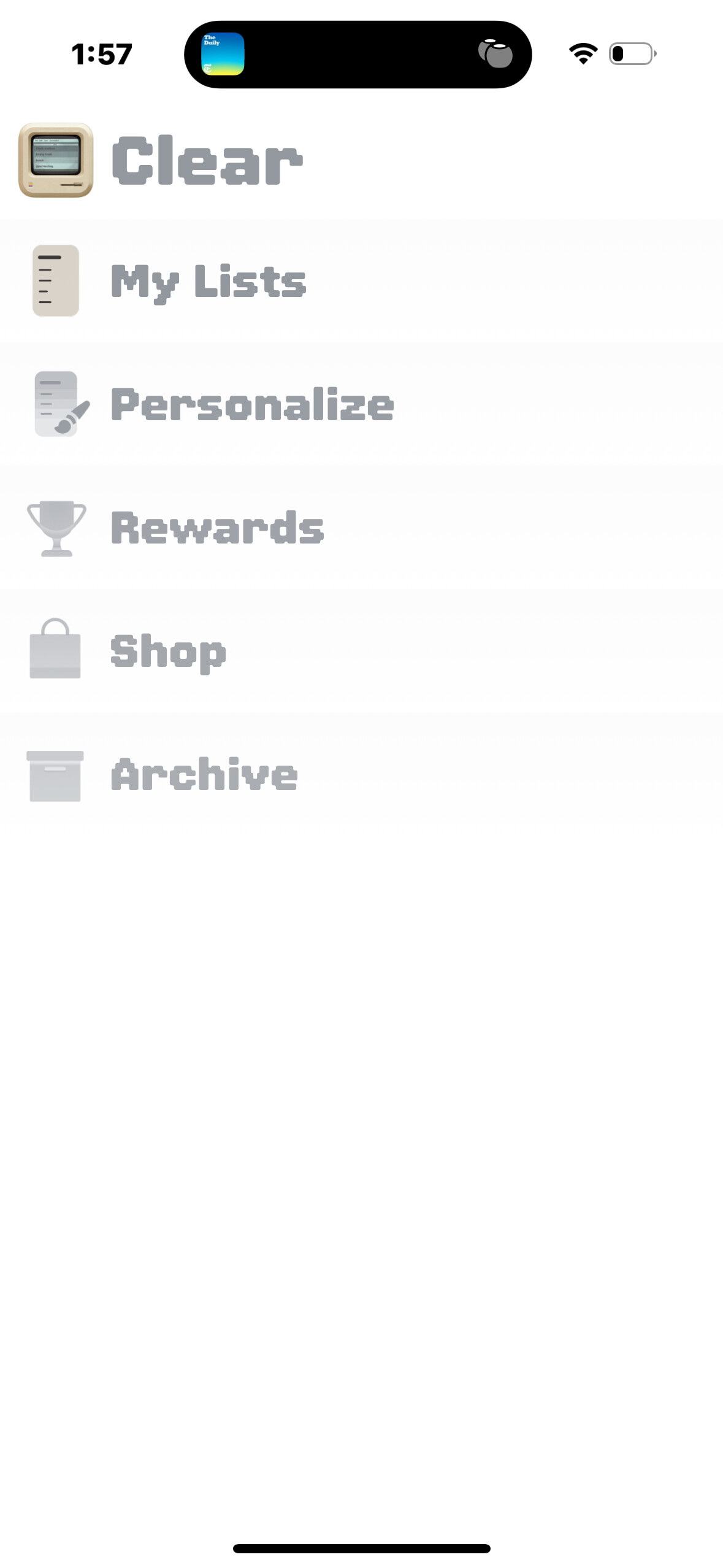
Noticed today that screenshots are rounded at the corners but still show some wallpaper outside the rounded edge

1 Like
I would really like to polish this off, very annoying when you want to show them off. Will see if we have time to look into this when we’re (probably) checking into tiling support this coming week.
1 Like
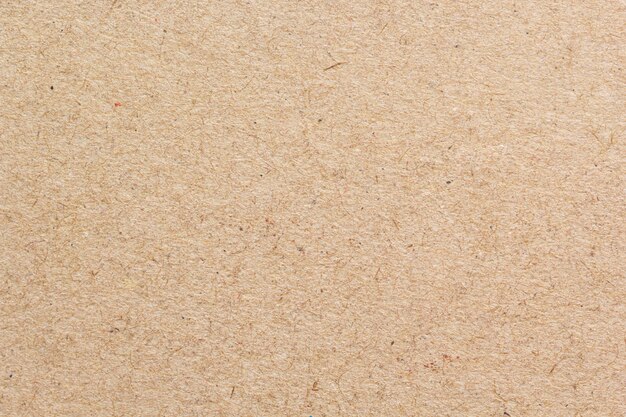
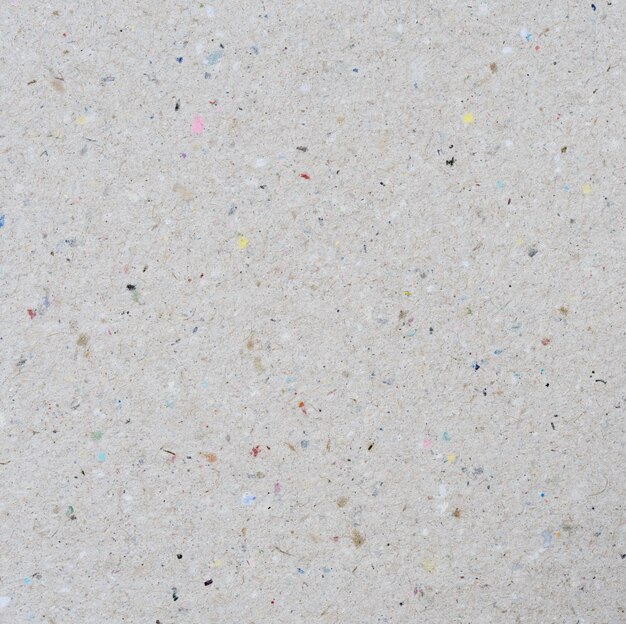
On a stationery tip, I’ve always loved recycled paper textures - could these be a thing?

Also, another request - the Focus theme greys out items lower down the list… but this only works effectively on short lists. On longer lists, the text appears to be basically all the same colour. Is there a way that the text gradient could be fixed so that no matter where you are in a long list, the items at the top of the screen are always higher contrast than the ones nearer the bottom?
3 Likes
I think the heatmap ‘weighting’ towards the top is a pretty solid idea… it is on the polish list, just needs some wire framing internally to confirm it’s the way to go.
And those are some great stationary ideas, definitely a coziness to the recycled specks, kind of like whole wheat bread.
3 Likes

Yes, a beautiful theme, and with the current font, looks elegant.
I will be buying this theme to use this combo the next time Plasma is in the shop, thanks for sharing!

Just picked up a couple of icons. So now I’ve finally got the Gameboy ‘loadout’ (well, as close as I can get without a Nintendo font). Also picked up the VHS Logo icon as I thought it would pair well with the Simple Black theme. Looks very clean, especially using the Futura font. Roll on Clear Music and Field Book Orange!


3 Likes
I knew I wanted the ‘Dieter’ theme, as the list level was yet another off-white variant to add to my collection… however I wasn’t expecting how cool the top level menu would look. The grey-brown looks awesome, especially when set off by the flash of red from the Calendar icon. Paired here with the iAWriter Quattro font (the most Braun-like font I have access to):


6 Likes


Hey, how do you have the Plamo theme? Was it available on the store recently?
The Plamo theme has not yet been presented in the store. These are just archive screenshots published here by Phill.
1 Like
Looks good!
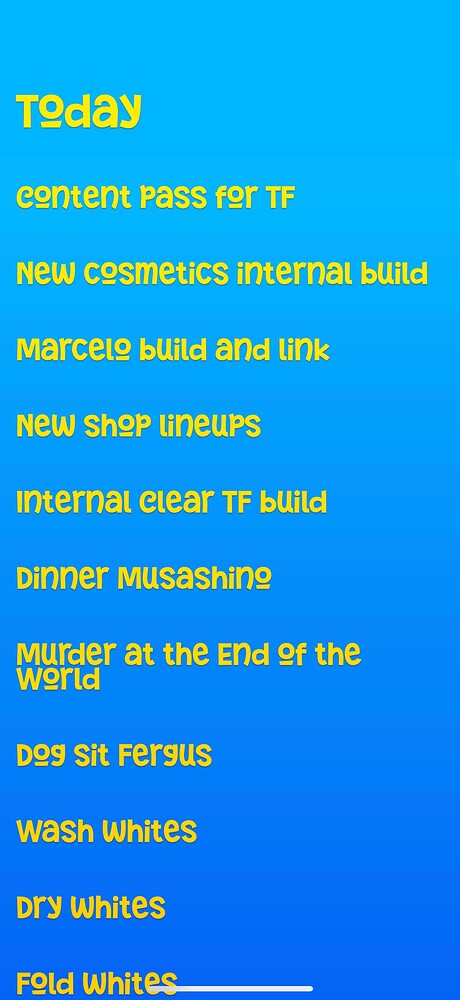
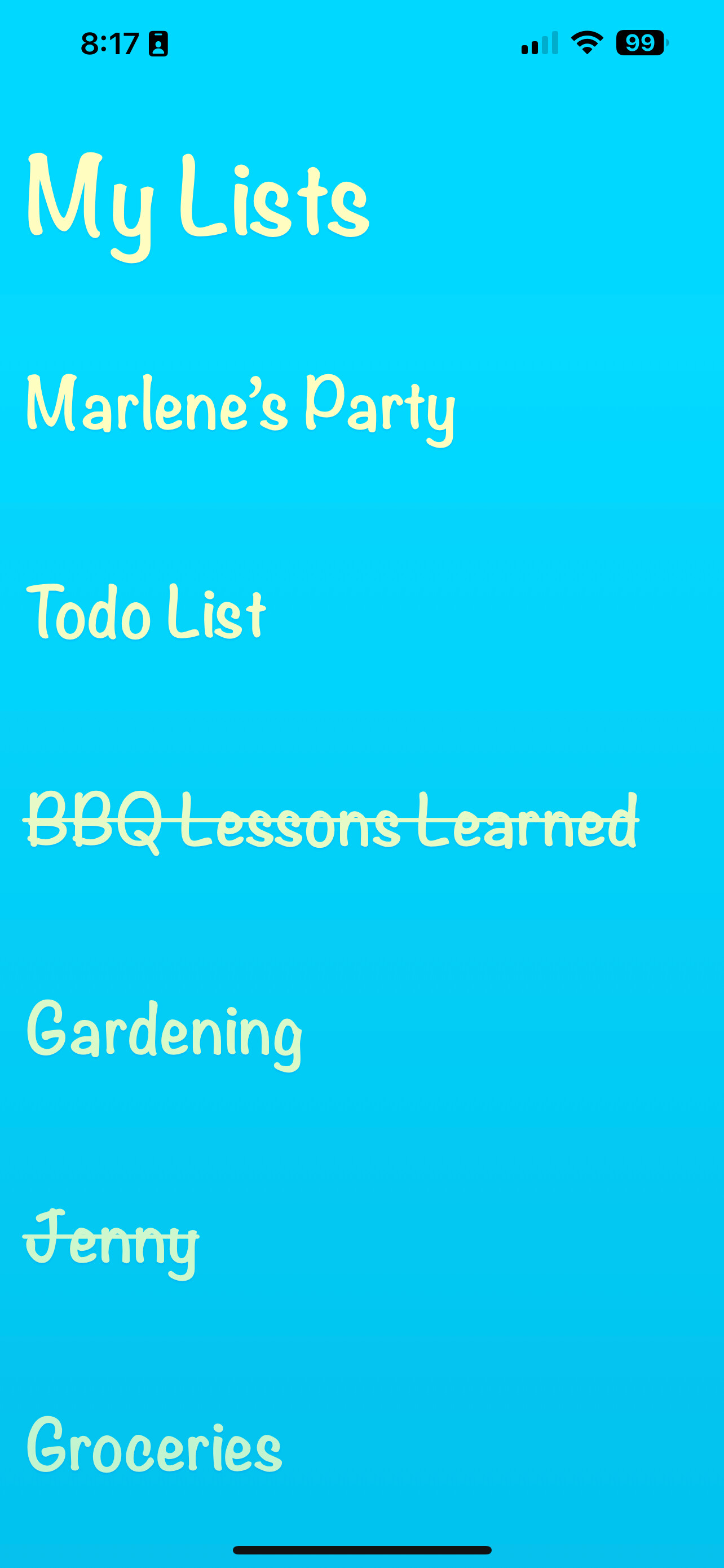
Also, I’m intrigued by the possible content of the ‘BBQ lessons learned’ list ![]()