The designs have been amazing so far! I think the icons that catch my eye have been the more colorful ones with neon colors that make them stick out. Some ideas for other icons that came to mind are: chrome effect, floral, a sunset or water background, monstera leaves, and other nature themes.
It’s a little inconsistent right now, but the goal we want to work towards is total consistency through the app. Batch drag and drop support at least within all menus etc. Clear’s design direction is a sandbox like this.
Loving the new icons above, and really appreciate today’s update bringing the status bar back!
Another vote from me for separate light/dark themes. I love Bondi during the day but it really sticks out from all my other apps (not in a good way) at night.
EDIT: sorry, thought this was the feedback / feature request thread
I’m very curious, are you using some generative AI for rapid sketching or is this hand done?
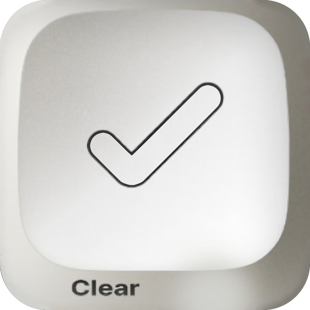
We’re generally avoiding shipping AI art in Clear (the one exception is the Clear AI sound pack which leaned on an AI voice tool, but I think that’s an OK creative reasoning? ) but it seems very powerful for sketching, though very difficult to fine tune results. Like I’m eyeing that check logo on the cap, that kind of thing would be hard to tune in.
When we quickly produced Web Roulette last year we were actually using an AI generated icon for a while until David was back from vacation and redrew it.
Cap idea is great, I like icons that kind of organically fill the icon silhouette/shape. Would a squircle tennis ball be too weird? We might have to take a look at that and some other ‘sports balls’ ones later.
Yes, I do it manually, in the mobile version of Pixelmator, in my free time. Inspired by different icons from the Internet. I’m not sure about the tennis ball, maybe it’s really better to return to it later, when there are more balls.
Dang that makes it extra cool. The cap one we will absolutely need to get to. (Man it would be fun to pair that with a real life matching merch option too. Maybe 2025 for real life cosmetics haha.)