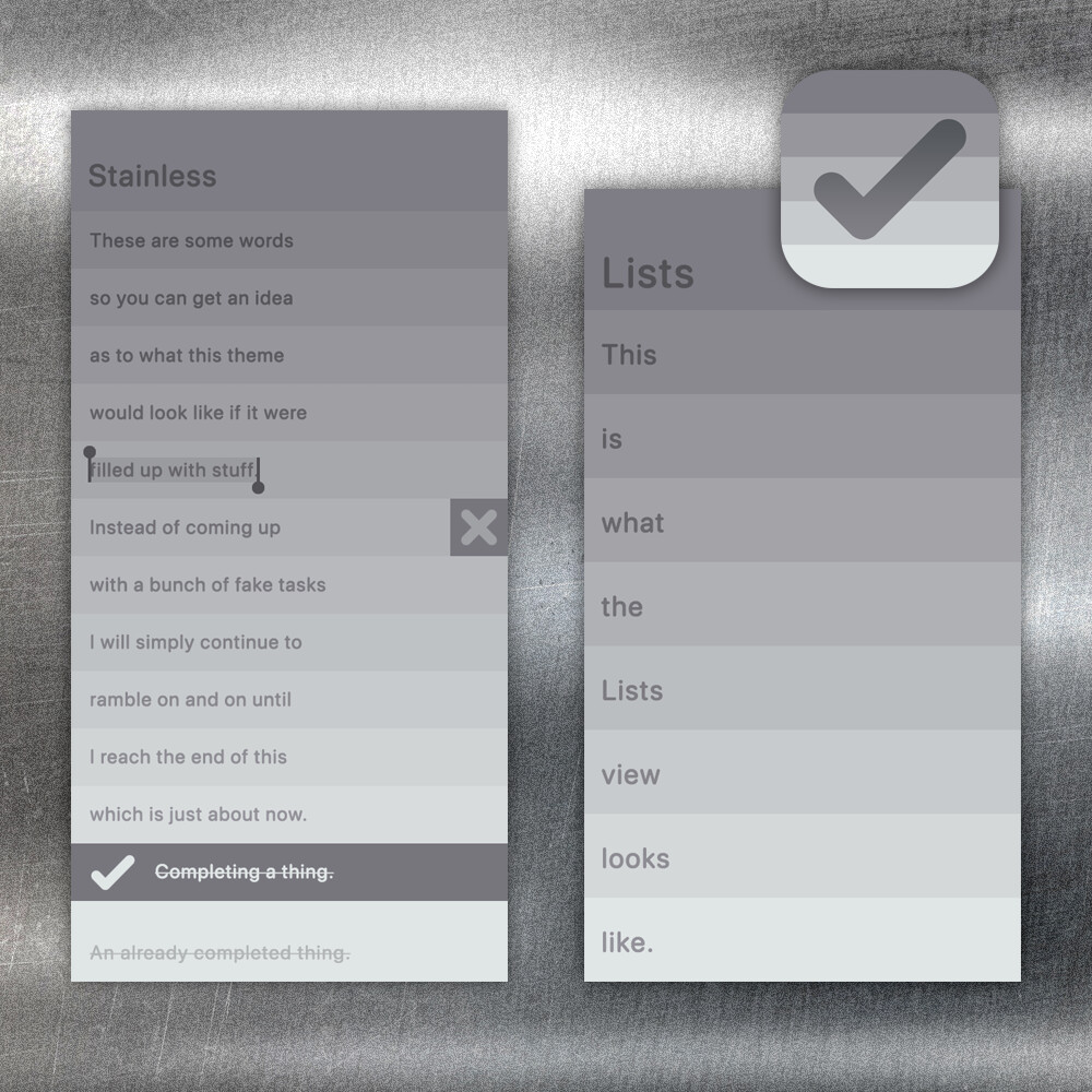
David ported your theme mockups:

How do you want to be credited? (We have been tagging community themes/icons by their designer’s twitter username so far.)
David ported your theme mockups:
How do you want to be credited? (We have been tagging community themes/icons by their designer’s twitter username so far.)
Fancy. Very cool.
Uhh… not much of a social media user actually. Been considering making a lil UI account though. @rykanthrope is a placeholder, would that be fine?
Also, curiously, is Duncan Horne’s holographic icon ever making it in? I think that’s one of the best ones yet.
Sure sounds good.
Good reminder to hit him up about it. I have honestly been a little too spread thin the past month or so and dropping some balls!
Understandable. Almost at the finish line, kinda. lol.
The themes look good. Running Inferno right now in an attempt to leave myself no relief whatsoever from the hellscape that is Austin.
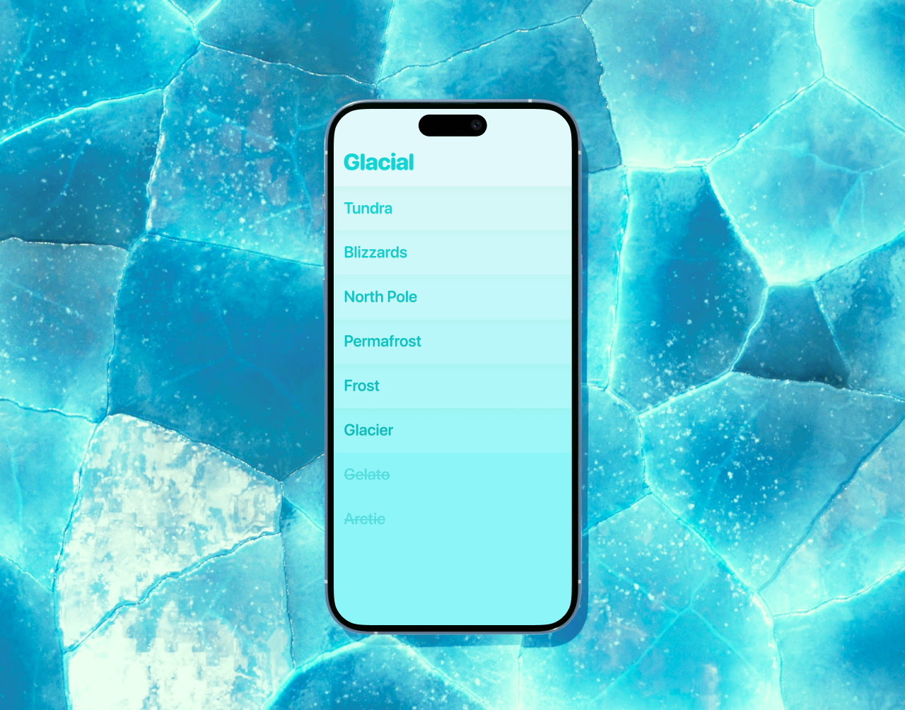
I love the changes you made to Inferno, very well done. For Glacial, if you were open to further tweaking, I might suggest making the lower list items, the delete background, and the bottom of the check in the app icon a little darker and a little bluer? Somewhere in the #009999 direction? It looks kinda green and toothpasty with the changes. idk, nbd.
And while we’re on the themes topic, just a couple things I’ve noticed and wanted to report:

Just wanted to put that out there since y’all are on to the polishing phase. Thanks much.
Hmm it’s been some time but I wonder if we were actually thinking it might be confusing if the list header kind of read as ‘the first item in the list’. But the current take feels kind of unsure which it wants to be, so let me stew on it.
Also what the hell, you’re in Austin TX? I am too, could meet up for coffee or something sometime.
I figured it was something like that, but honestly it just looks weird to me personally. Like if you have a list with one item—which I know is unusual, but that’s how every list starts out—instead of going blue→green→yellow, it goes blue→basically the same blue→yellow, and thus looks not as smooth. Not a big deal though. I can see the other side.
And yessir, North Loop area. Would be down.
Cool yeah I’ll DM you.
![]()
![]() me patiently waiting for your new themes
me patiently waiting for your new themes
I love the biome thing going on with Jungle/Red Rocks. Any more ideas there? Would make for a great set. (And we should work out some deal if your theme contributions escalate like this!)
Allow me to throw my hat into the ring with Classic Platinum.
(Layout shamelessly lifted from @r1y3. No need to reinvent the wheel, right?)
I have no idea how feasible this is, with the list items having that subtly embossed look to them, but I could probably get close with a gradient instead if need be. While Charcoal is not included as a system font on iOS, Chicago FLF would be an acceptable replacement.
I also tried setting the list items in Geneva, another old font once used for UI text that is miraculously still included in macOS (but not iOS). That looked fine, but the headings did not, and Geneva lacks a bold weight. I believe the old text rendering frameworks generated one on the fly where it was needed.
wooooooow this looks awesome! ![]()
Yeah it would need at least a couple features added for the divider lines and separate header coloring. But we should try to support them in the updates roadmap for the kind of fun new themes it would unlock.
I used to be super into themes/GUI customization back in the day so I’m definitely hoping we can go kind of nuts there over time with more room for expression.
Thank you for making me look less insane by no longer being the only one to post, lol. Very nice! Definitely some unsupported elements in there, but my list title colors I frequently use aren’t supported either. I just kinda figure they’ll work it out if need be.
EDIT: Yeah, see, that is so tight. Never would’ve thought to do one like that.
Haven’t thought much about biomes/sets, the idea list is long but random. But yeah there’s always something. Got a sweet Coronado one that’s ready. Painted Desert. Played around with bluebonnets real quick but it would have been too close to Hillside.
Let it go on record that I look forward to viewing this thread and seeing what potential themes you (and others) have posted; I may not be vocal about it, so keep it going. ![]()
Wow, thanks, that’s nice to hear. It’s funny because just yesterday I was like “let me burn off these last few themes then stop annoying everybody”. Then @cmdrspock hit us with one, now you saying this, maybe I’ll keep dropping one every now and then. It’s just a balance of not wanting to look starved for attention and being weirdly addicted to making them, ha. Just wanna see our lil app looking fly.
I appreciate the warm reception for my first theme submission ![]() I plan to continue with these, maybe starting with some themes inspired by retro hardware. It’s a logical next step after a retro UI-inspired theme. Besides, now that I’ve got a template set up, it’d be a shame to let it sit there collecting dust.
I plan to continue with these, maybe starting with some themes inspired by retro hardware. It’s a logical next step after a retro UI-inspired theme. Besides, now that I’ve got a template set up, it’d be a shame to let it sit there collecting dust.