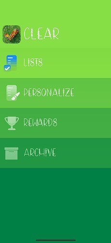
Honestly, I don’t like the implementation of 3D Touch to the app. I had to turn it off because I was always accidentally exiting a list, especially when setting dates for reminders. Thought it was cool at first, but proved to be a bit of a nuisance.
Today I changed it to CALABI with the same icon and font from yesterday (ITEM BOX + WOMPRAT).
PS: I didn’t expect to love ITEM BOX so much. It is so well designed.
Just dropping a bit of trivia on Calabi. It was my favorite theme entered into the Mac Themes contest (a community site I ran when I was in high school) by the designer Sascha Höhne, who had amazing free icon sets and wallpaper he would make and distribute on his RAD.E8 personal site.
Sadly I couldn’t find the original Mac mockup, but this was someone’s Windows theme knockoff of the never shipped Mac theme:
Anyways now you all know what a nerd I was in high school, and how the level of personalization in Clear 2 is a personal interest of mine that I’d like to share and not an agenda-driven contrivance like some have been worrying in reviews and such ![]()
I also met David back then in this forum scene! And we have been designing apps together since.
Nice! It’s a beautiful theme.
Those things are nice for the “About Clear” quotes. I loved to learn (in Twitter) that those other cha-chings in store are actually people buying!
Yeah that quote pack is definitely for the fans haha. We’ll need to update it and other packs as we go.
Is it possible to change this topic title? I can’t find a way.
If yes, change it for something like “Show us your Clear setup” or something like this! ![]()
Good idea, done! ![]() Gosh darn this minimum character thing, let me look into reducing it.
Gosh darn this minimum character thing, let me look into reducing it.
Thank you, much better now ![]()
![]()
I’m still waiting for Purple Dragon, from the betas, to make a comeback, so I can finish my setup ![]()
This thread is so funny to me because I really hate some of these setups ![]() but that just proves why the personalization is so great
but that just proves why the personalization is so great
100%.
Similar thing with fonts. I had no idea there was this world of more fun/whimsical/niche fonts out there, because no app that has licensed fonts, licenses those, and just goes for the same set of free or safe ones.
Sure a font with little dog paw prints all over it is objectively less legible and a ridiculous option for MOST, but why hold it back from the person who is just going to be smiling every day typing with it!
Here’s some of my favorite combos from when we added a bunch of the fonts:
Yeah I realized putting together the bestsellers shop lineup for today that this would be a letdown lineup for the super collectors shopping since day one ![]()
Probably good for converting some first time customers though, we’ll see how it goes!
It’s ok! ![]()
Here is my current set up with pistachio cream and this splatter art icon I just bought. Would love to see all green for “Clear Boy” theme, but idk maybe was set up like that due to the Gameboy icon that comes with it.
Yeah it was intentional but I am considering changing that one… have a feeling most people wanted the consistent screen look across!
Shangri-La is a good alternative to Purple Dragon haha
(I know I’m annoying about that particular theme, sorry, I just loved it that much ![]() )
)


