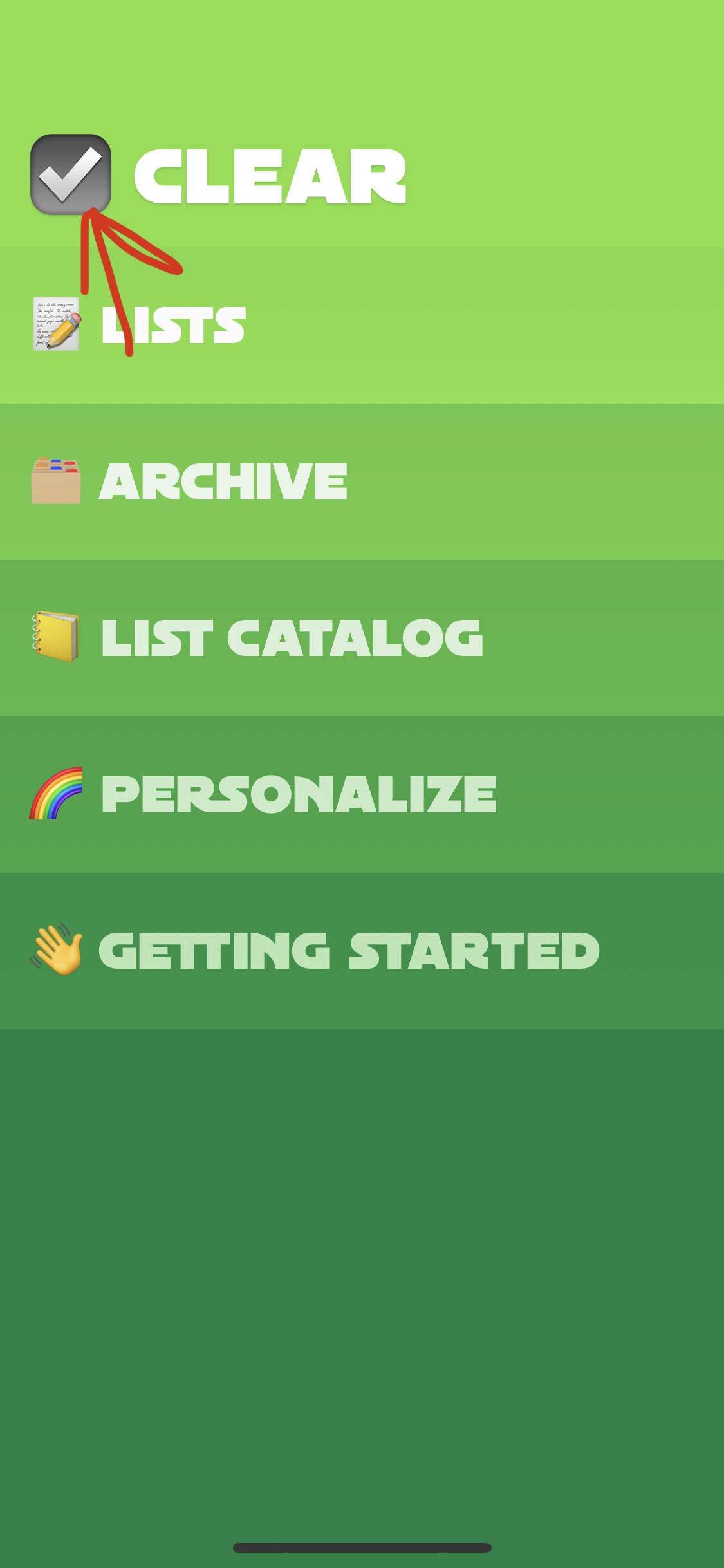
Instead of the generic check mark emoji in the top left, why not use the currently set icon so you get to enjoy it inside the app too?
That’s a good idea ![]()
![]()
But if you think about it really well, you might come this realization:
Image opening the Mail app and having the Mail icon right there, saying:
[ICON] MAIL
Inbox
Sent
Archive etc
Then, opening lets say Reminders and there’s
[ICON] REMINDERS
Today
Tomorrow
Complete
Do you see the pattern? Would you find it pleasing and beautiful or a waste of space? I mean, you KNOW you are in the reminders/mail/whatever, since you just tapped the icon on your homescreen! Why advertise it in the app? And why would you INCLUDE your icon INSIDE the app? Inception? Tap the icon within the app, while you have already tapped it on your homescreen?
My point is: just because we CAN HAVE something in a UI, doesn’t mean it SHOULD indeed be there.
We’re not 100% sure yet on the emoji on top levels of the app, or if we end up trying more SF symbols, or no icons etc. And mirroring the app icon requires a bit of work. So holding off for the moment and will see when we start entering the more general final fixing and polishing phase of things.