I will second this. Losing the back button would be an annoyance. But eliminate the ability to add items with one finger at your peril. I am certain there would be backlash on that - I don’t think Madeirabhoy and myself are outliers.
Are either of you aware that you can tap bottom or top of the list to add? You have to reach a little more to add to the top that way, but I have to presume those one handed typing cases involves stretching period!
Oh, can you give me a rough sense of how often you add one handed vs. 2 handed situations? Also curious if there’s some specific recurring use cases where this comes up.
Basically yeah, tap bottom or top of list to add would stay as it is. Will see if I can get a preview TestFlight up later today to sanity check with some of you here.
That’s great, thank you for your answer.
For instance, when I’m on the go and want to add something quickly, I have a single hand free. I open my Inbox list and it’s full of items, so bottom tap won’t work. For top tap, even with my small phone (SE 3rd gen), I’d have to let it slide down a bit in my hand, tap the top, then bring it back to the “typing position”.
Right now I just pull down a bit and start typing.
Shortcuts support would definitely eliminate that use case, because I would just dictate it and the item will go where it needs to.
And I must add, using Clear two handed feels good :–)
Got it, and yeah that is interesting about shortcuts/dictation/Siri. I’m sure there are some times where dictating is awkward, but maybe in most cases it’s a better option than one handed typing.
I’m pretty excited for iOS 18 Siri so we should at least be scouting this out sometime this summer.
see i would never use siri unless i was in my flat all alone. too self conscious. tapping at the bottom works but its more hassle than the present way if the list is longer than a screen page. tapping at the top… just tried it. no likey. im guessing its supposed to be between the list name and the first entry, but most of the time i hit the list name or the first entry.
for me, im 95% one handed typing. i have a flip cover and often the way i hold my phone is with the flip only half open, in my left hand, using the phone with my right. for me its the unconscious natural way to hold it. in part as i have a weaker left little finger so i dont like opening the flip right round and balancing on the finger.
just asking as i must have missed something, why is the pull down to add disappearing? is it to avoid clashing with pull down at the side for going back?
Can’t a quick swipe down be to add, and a longer one be to go back? Honestly, two-thumbing it every time sounds awful.
These double loaded gestures and redundant ones (and just the invisible back button in itself, my fault on that one) feel like they upset the elegance Clear aspires to, and deeply at its core. We were really feeling this when testing this with new people and working on improving onboarding.
Always felt compromised to me the way just dragging a little more and you can accidentally back out instead of creating an item, etc.
But yeah let me think on this one handed entry some more, and I would still be curious what you and others think about the rest of the redo once it’s up on TestFlight.
Do you know you can tap to add at the top or bottom of a list too?
Bottom doesn’t offer much on a list longer than a few things. Top, I guess we’ll see.
Wait, there’s talk of getting rid of pull down to add? That’s like, one of the most useful, intuitive, fastest, and enjoyable gestures Clear has (the other is probably pull down further to exit a list—love that one.) Also personally I think for gestures I most often use one hand, and then type whatever with two hands.
And just chiming in as someone who would literally never use Siri. I have Siri turned off on all my devices because accidentally activating it when I never use it was annoying.
Pull to Add has some issues, though much of it has to do with the double loading with pull to go back. Imagine for instance teaching someone new to Clear:
Pull to add.
Just don’t pull too much, that will go back.
But if you want to add elsewhere, tap. Or pinch to insert.
Back in the original 1.0 development I actually just relented to pull to go back as a one handed option and crutch of a design last minute… that’s why it’s double loaded, and that’s always been marked as pretty compromised to me. 2.0 release’s version of that was the invisible home button ![]()
The issue we’re trying to unravel is systemically, the current gesture set feels overloaded, not as elegant and symmetric as it should be, and overly redundant, so much harder and more complex to internalize. And while a lot of this seems easily excusable from the longterm user standpoint, I really think we need to scrutinize it and clean it up as elegantly as we can because it feels like a mess to teach to new people, and we need to do well there for Clear to have a thriving future.
And we can probably all agree that Clear’s simplicity and minimalist appeal would not do well with like, many layers and options of gestures stacking up over time.
Now, I don’t think there is a 100% compromise-free gesture set that is literally pristinely perfect. But my gut feeling is the current situation is like a 75% where it should be more like 90%+ for Clear, especially on the overall simplicity side.
As I said this is an ongoing experiment, but I do think we need to at least be asking these questions and trying some other approaches.
FWIW I don’t think there’s anything inherently wrong with the concept of a back button. In fact, my muscle memory has adapted to use this as the primary method of backing out of a list (as opposed to pulling down to go back).
I’m more than happy for the pull down action being used exclusively to create a new entry at the top of the list. I never realised until now that tapping at the bottom of the screen (in the corners) creates a new item at the bottom of a list. Ha!
My issue with the current back button implementation is that because the hit box is invisible, this leads to accidental triggers. As I mentioned in a previous post, I unfortunately cannot see a way of retaining a back button that you can see without either breaking the rectangle-based aesthetic, or making the back button hit box run across the bottom of the screen (which would then break the creation of new list items by tapping in the bottom corners).
What a conundrum…
We were all new people and we all picked it up quickly. And tbh I think the rewards helped with that. It made us do things over and over.
Yeah the invisibility of the back button is a problem, and I also noted in the latest keynote that Apple has adding a tap (or double tap?) the ‘home bar’ to type to Siri, which could become a problem.
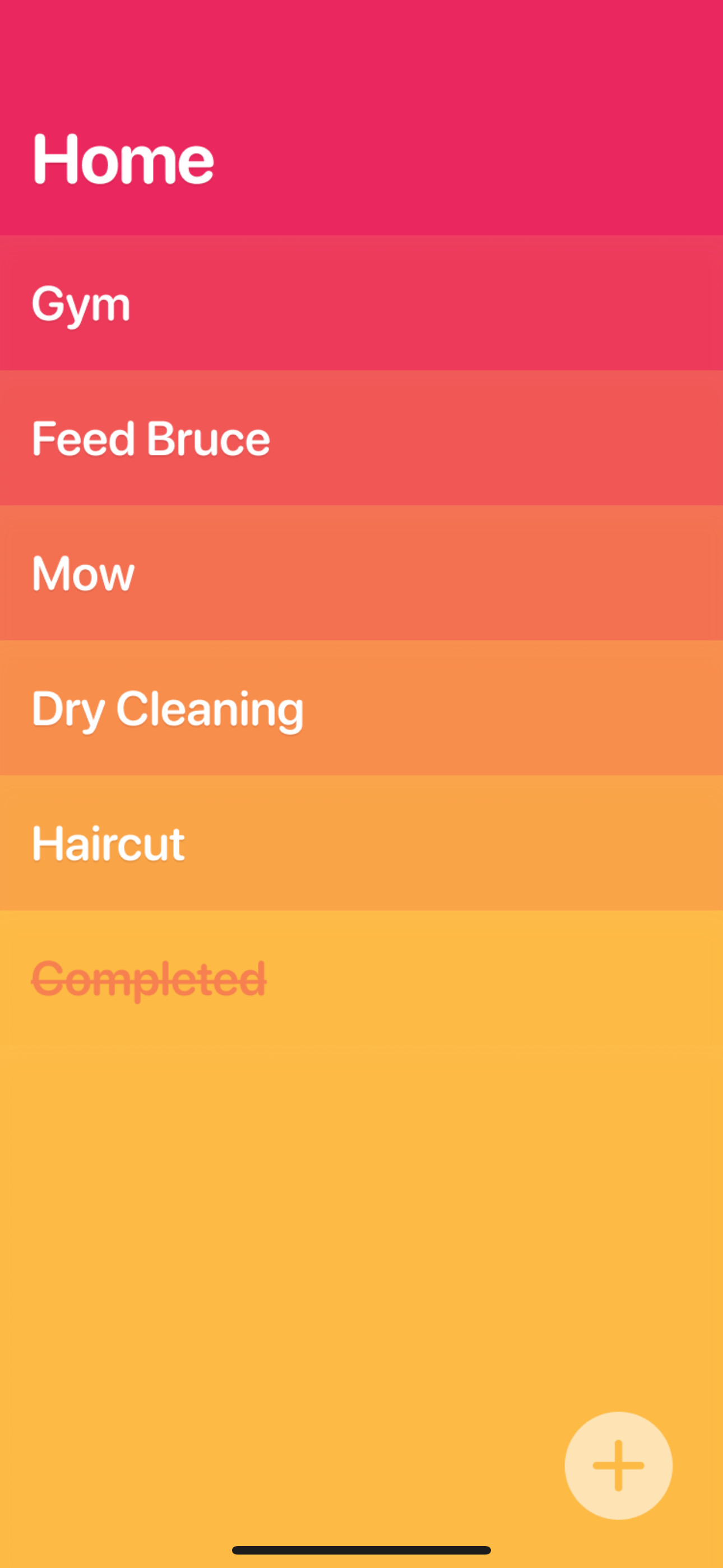
This new ‘add’ button feels promising though actually… uploading a build now.
Hmm… personally I’m finding the icon a little jarring - appreciate it’s a first pass/work in progress however. For me being right-handed I think I’d prefer it on the opposite side so I could reach across (i.e. not have to pull my thumb in to hit it), and probably have it be a bit bigger for target area. A chunkier ‘+’ icon might work better too - this smaller, slimmer one reminds me of a screw head viewed from above.
The build will have a bit more polished look to it, smaller and using some color values from theme to match.
If we were to go with this + button, it could be more versatile. Could see you being able to drag and drop it to the other side, or like Things one hand drag it to insert between rows. It is interesting.
Here’s a TestFlight of these gesture experiments: Join the Clear Lists beta - TestFlight - Apple
If you joined a previous TestFlight you may have to remove yourself from that first before accepting this. (It won’t delete your app or something.)
The + button could in theory be a setting you can turn off, for those who prize no screen clutter. But with this you could hand Clear to someone unfamiliar and they would be able to get going, maybe without instruction.
No plans to rush this out and just ship it next week or anything like that, there is a lot to sleep on here!